The challenge.
Quiet luxury, unmistakably Velour.
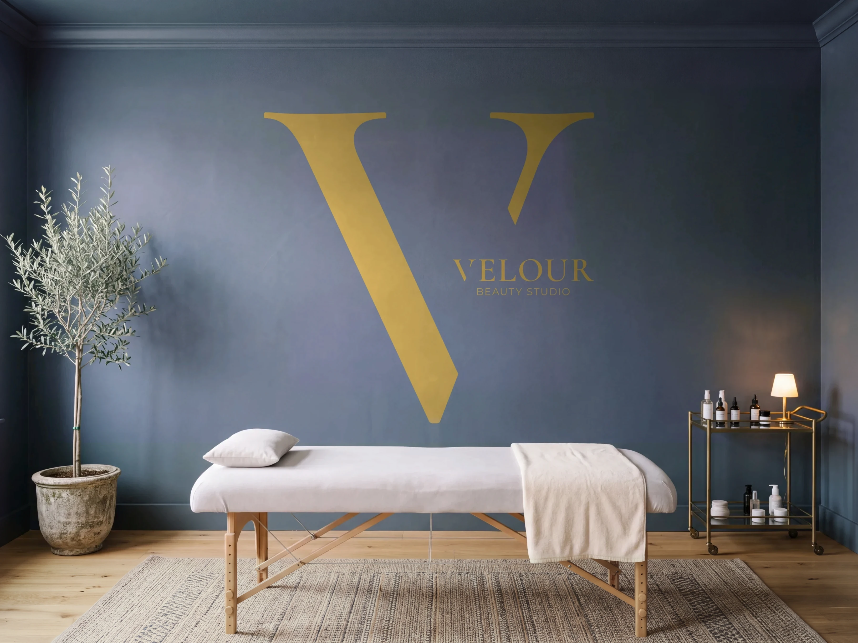
Velour is a beauty studio built around refined care, expert artistry and a calm, luxurious experience. The identity had to say that before a client walks through the door.
It needed to feel confident yet soft, modern but timeless, and luxurious without being loud, the tone set out in the brand positioning.
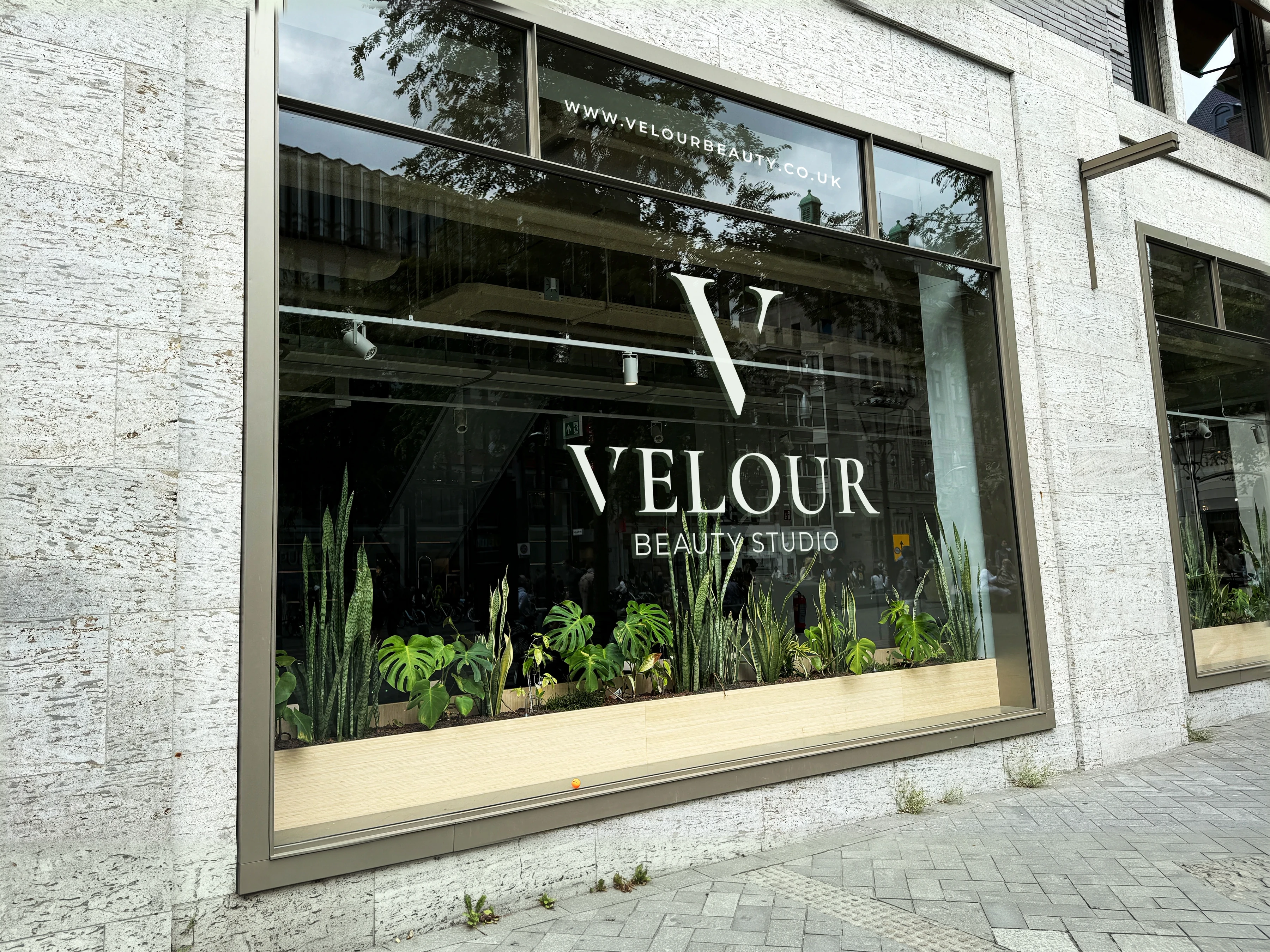
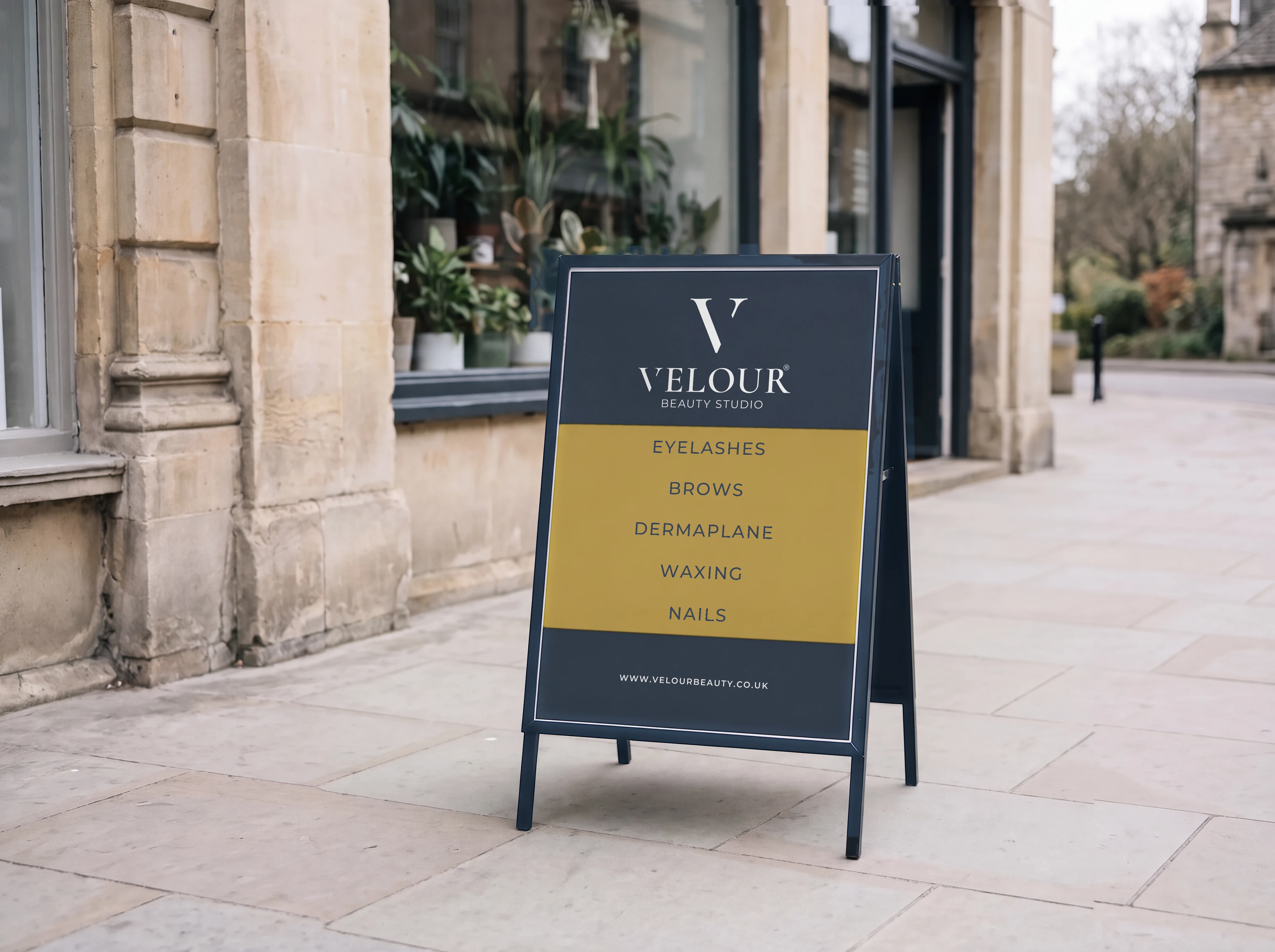
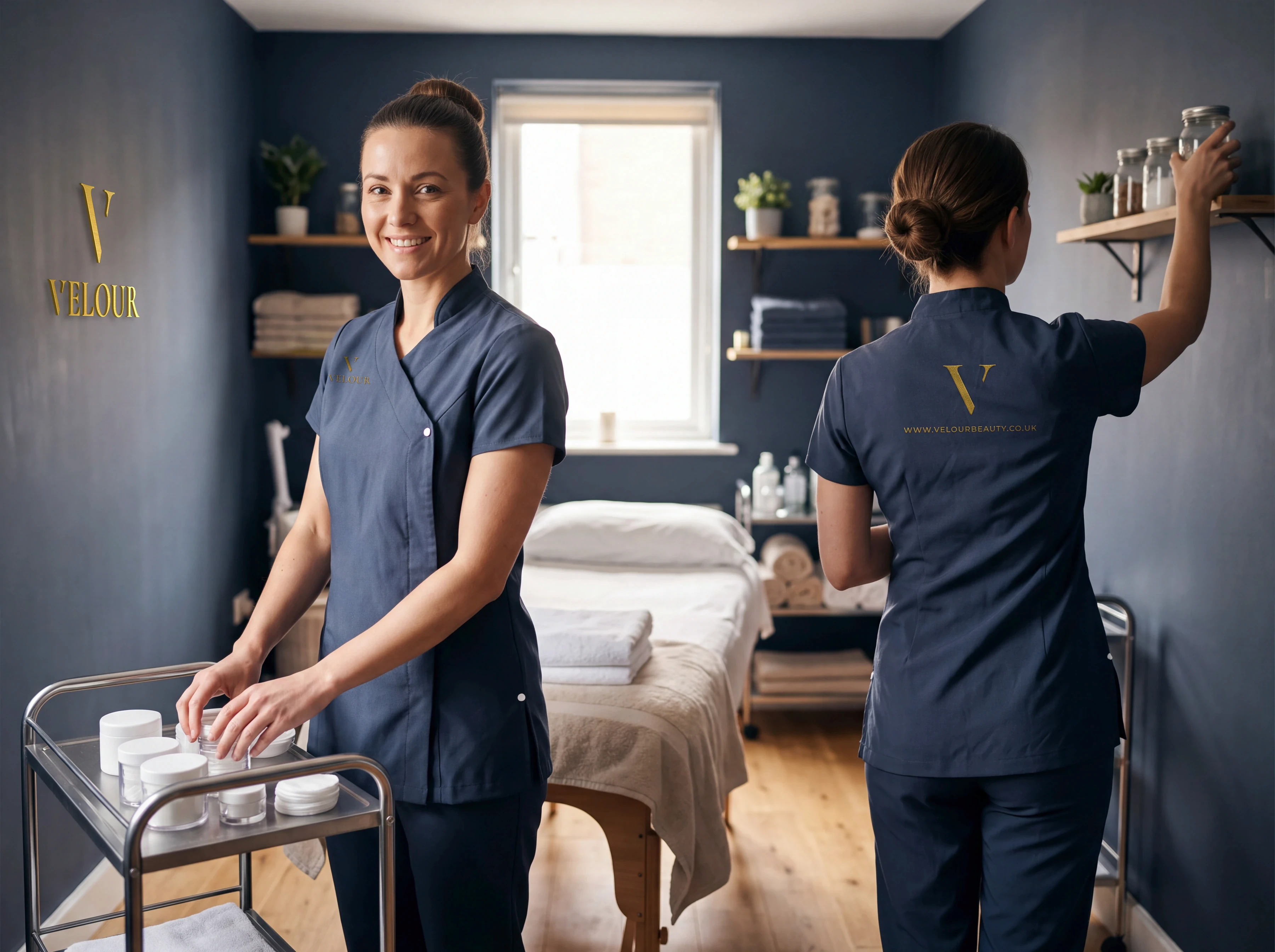
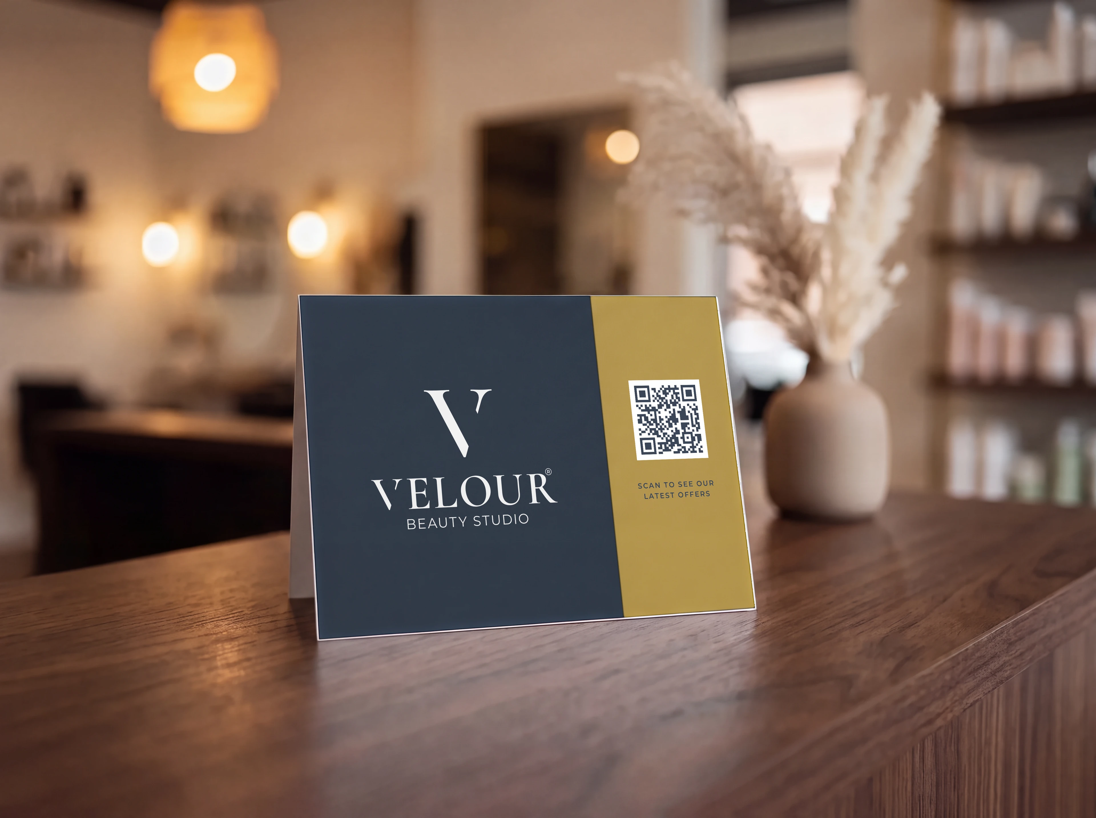
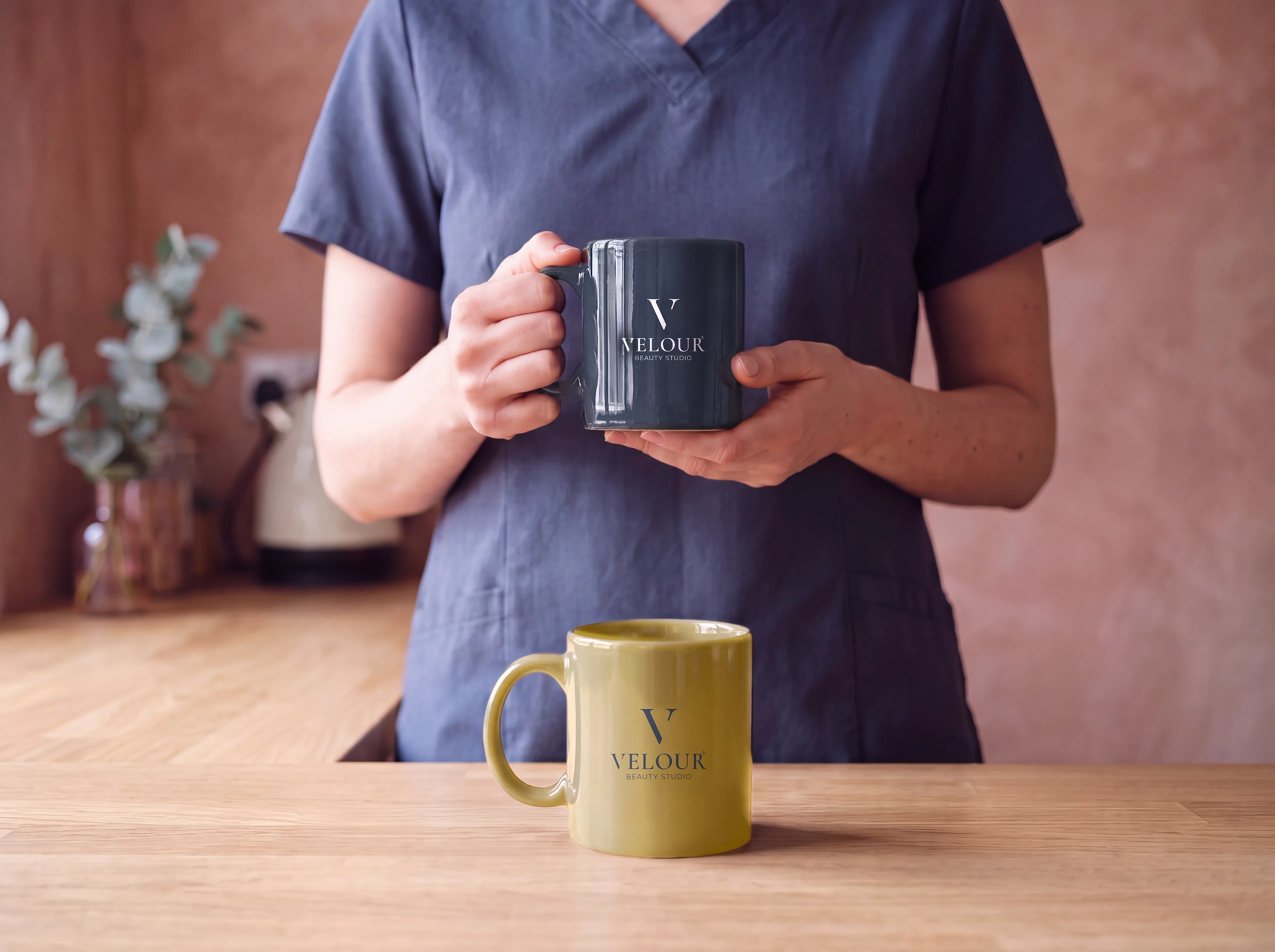
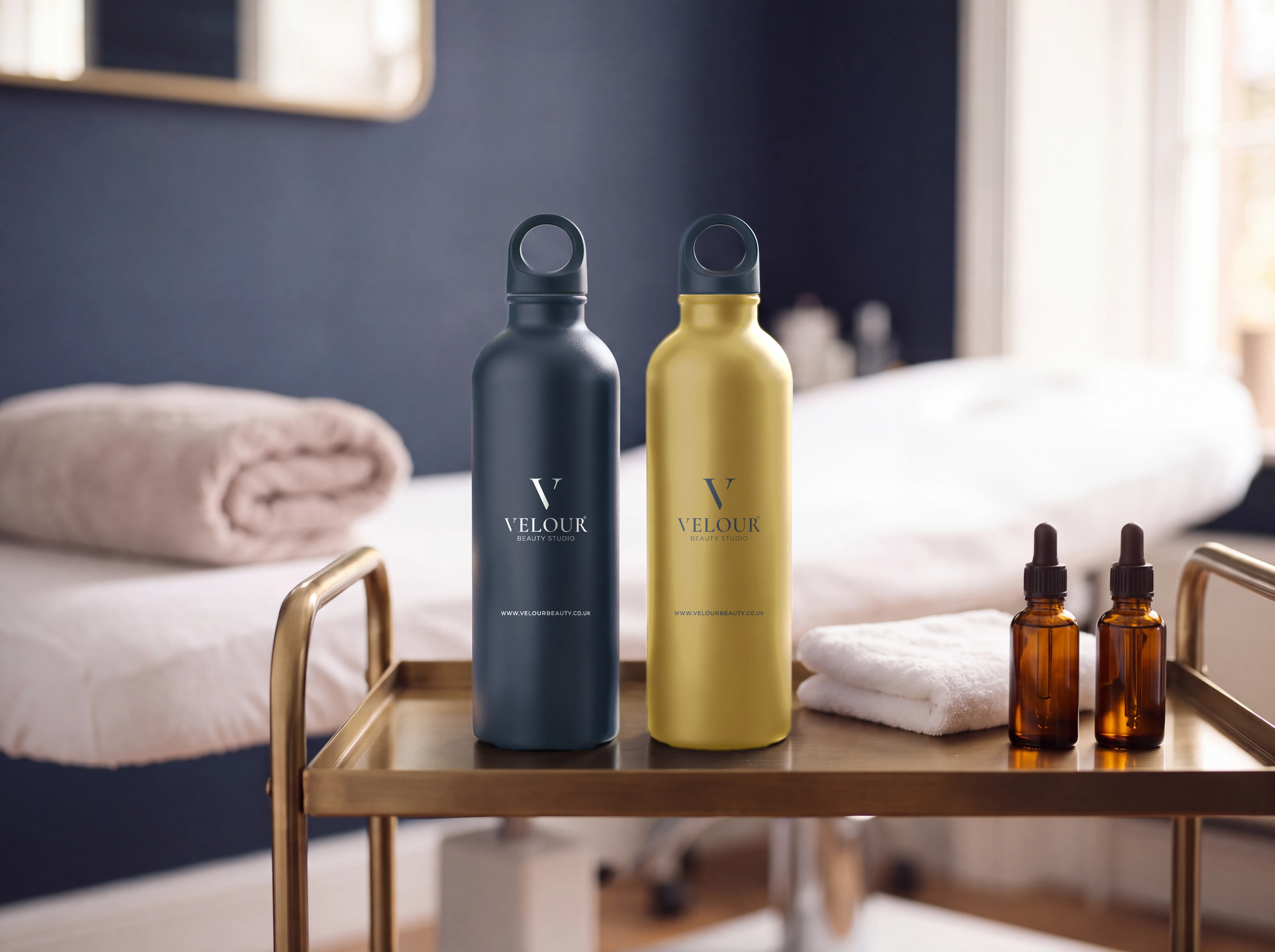
And it had to work everywhere clients meet the brand: on the shop window, at reception, on a uniform and in an Instagram feed.
Where they were
A classic serif V.
The mark starts from the capital V of Cormorant, the logo’s base typeface.
Where they wanted to be
One V mark.
A refined serif V with a separate flick, above the VELOUR wordmark and BEAUTY STUDIO.