← All work

Red Robin Garden Centre Group

How we created an identity for Red Robin Garden Centre Group that brings local garden centres together without losing the names people trust, shown at its founding centre, Cranswick, from the van to the shop floor and an ecommerce site in development.

Industry
Garden centres and retail
Customers
Local gardeners, families and café visitors at Cranswick Garden Centre near Driffield, and the future centres joining Red Robin Group
What we did
Brand strategy · Brand architecture · Logo design · Ecommerce website design
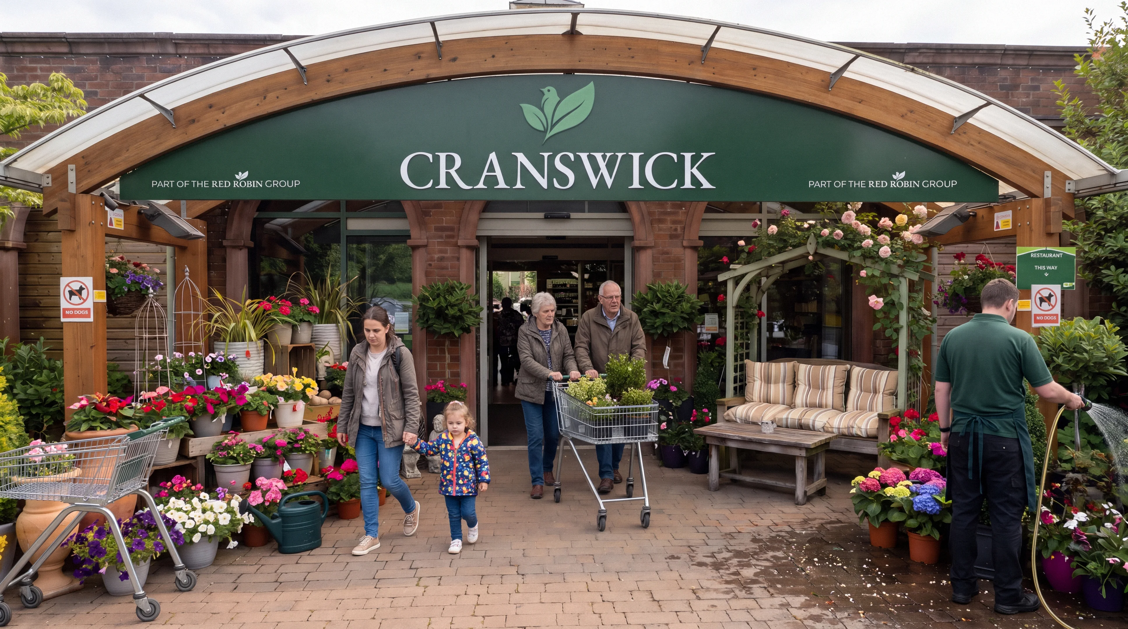
Visualisation: shoppers at the Cranswick Garden Centre entrance under the deep green fascia with the robin and leaf mark and Part of the Red Robin Group

The brief

Create a parent brand that can grow across many garden centres while each one keeps its own local name.

The challenge.

Build a group people recognise,​ ​without losing the local names they trust.

Red Robin Group starts with one garden centre, Cranswick, and a plan to bring more established centres into the family over time. Each of those centres already has a name, a reputation and regulars who have shopped there for years.

A blanket rebrand would throw that goodwill away. No visible parent brand at all would leave every centre working alone on signage, marketing and its website. The group needed something in between: one identity that is clearly its own, with room for each centre to stay itself.

It also had to work hard in a real retail setting, from a van on the road to a sign above a bench of houseplants and a product page on a phone.

Where they were

One centre,​ ​its own name.

Cranswick Garden Centre, a trusted local name near Driffield, set to become the founding location of a new group with no parent brand yet.

Where they wanted to be

One family,​ ​local names kept.

A Red Robin Group identity that endorses each centre. Cranswick keeps its name and gains a green colourway, shared typography and a clear Part of the Red Robin Group line.
What we did.

One robin, two roles,​ ​and every touchpoint in between.

Brand architecture

We set out a simple structure: each centre keeps its existing name and sits under the line Part of the Red Robin Group. The group earns recognition across every location, and customers still find the centre they know.

Mark, colour and type

After six initial explorations, the mark developed from a pair of leaves into a robin settled among foliage. Robin Red and Burnt Red belong to the group, Evergreen and Moss Green to the centres, with two shared neutrals. EB Garamond carries headlines and signage, and Montserrat handles everything practical.

From the van to the shop floor

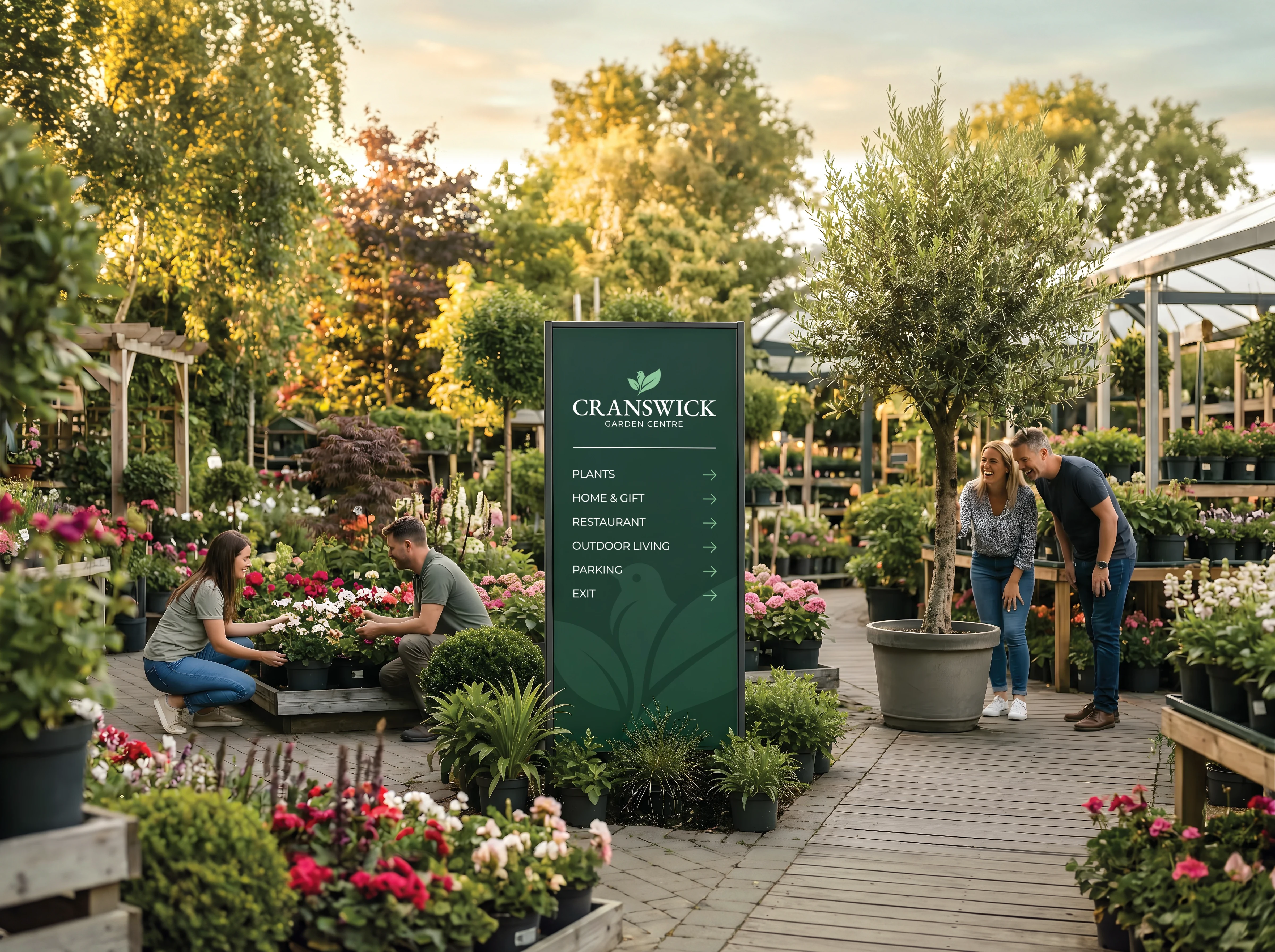
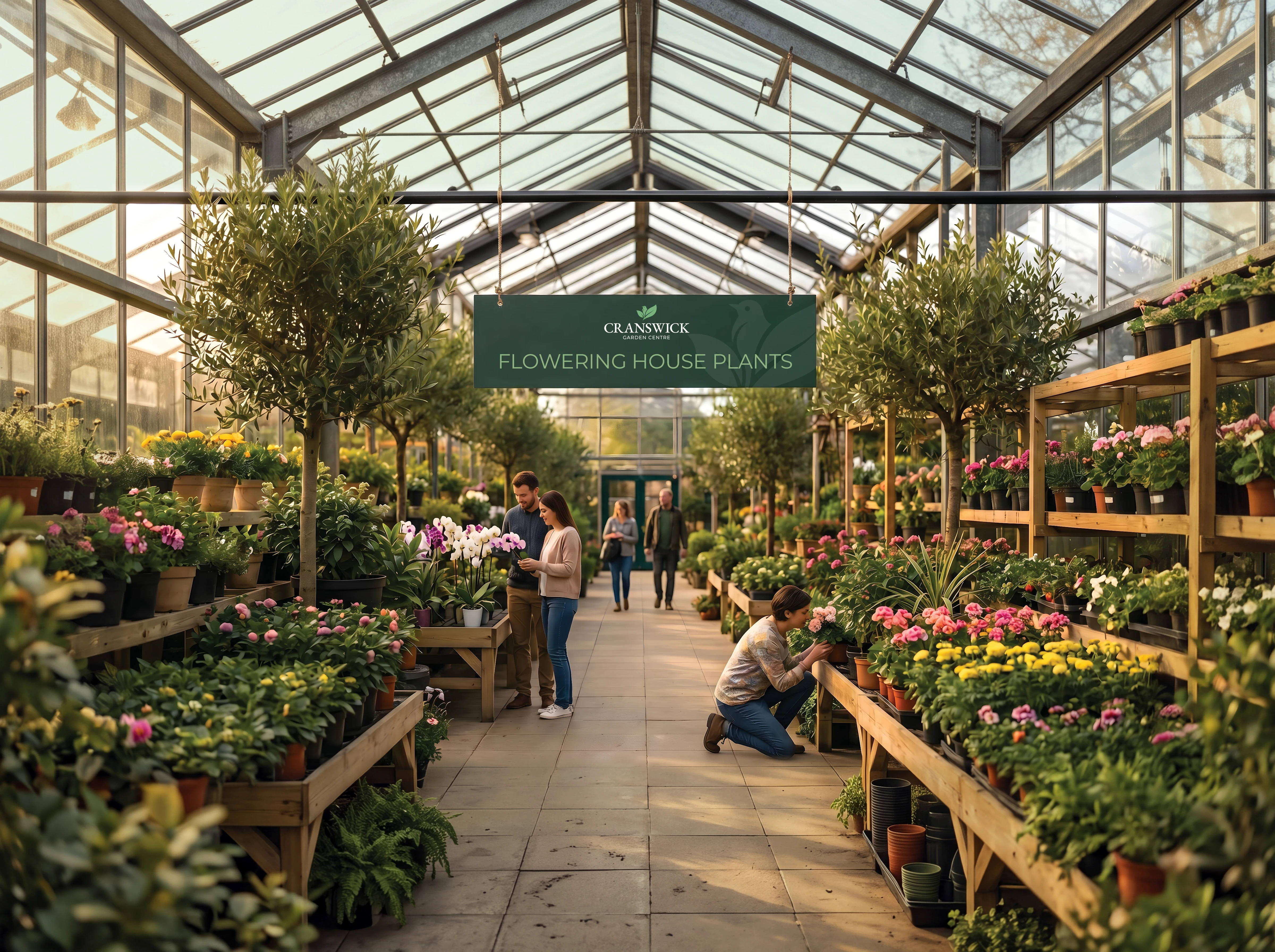
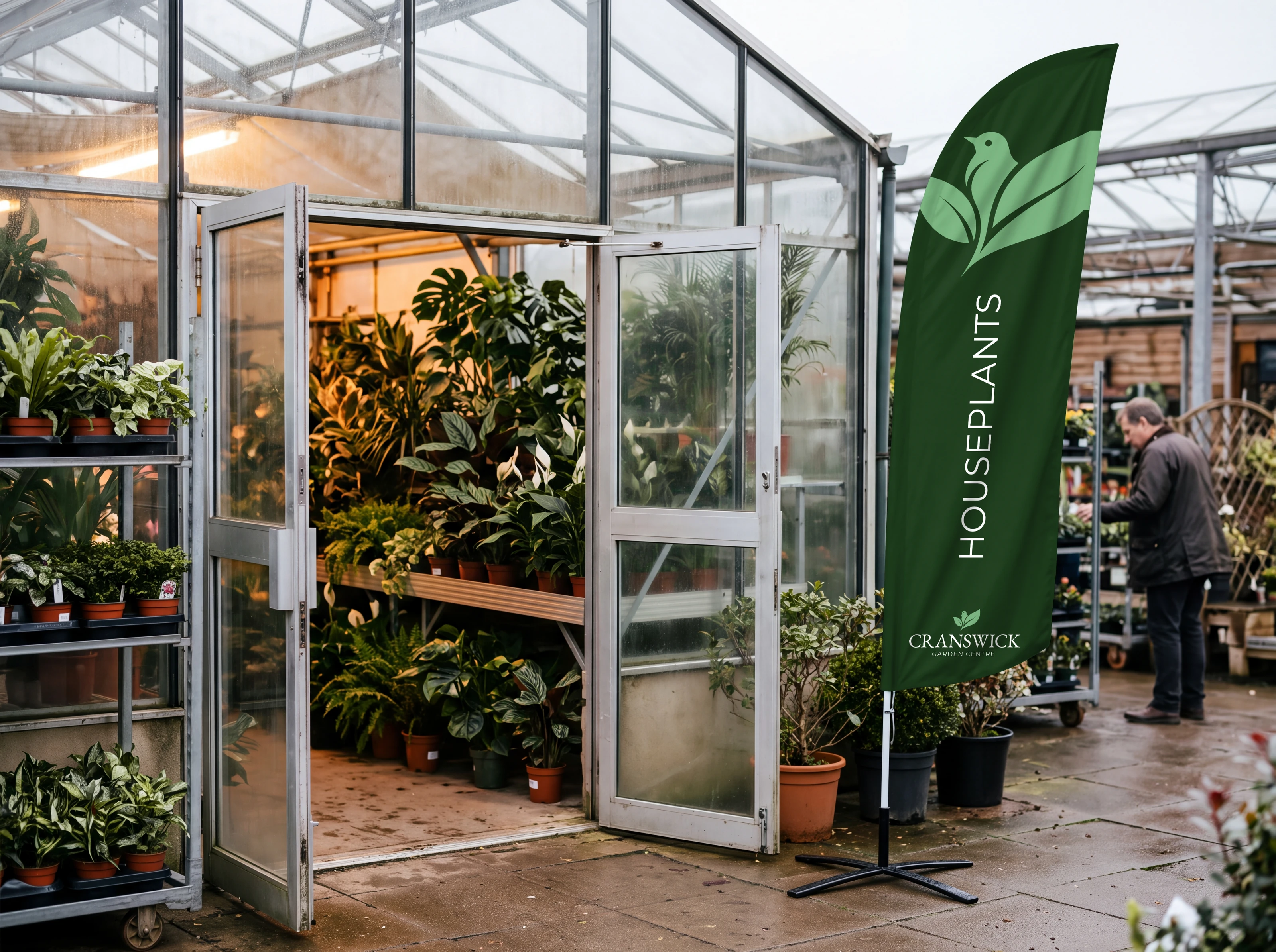
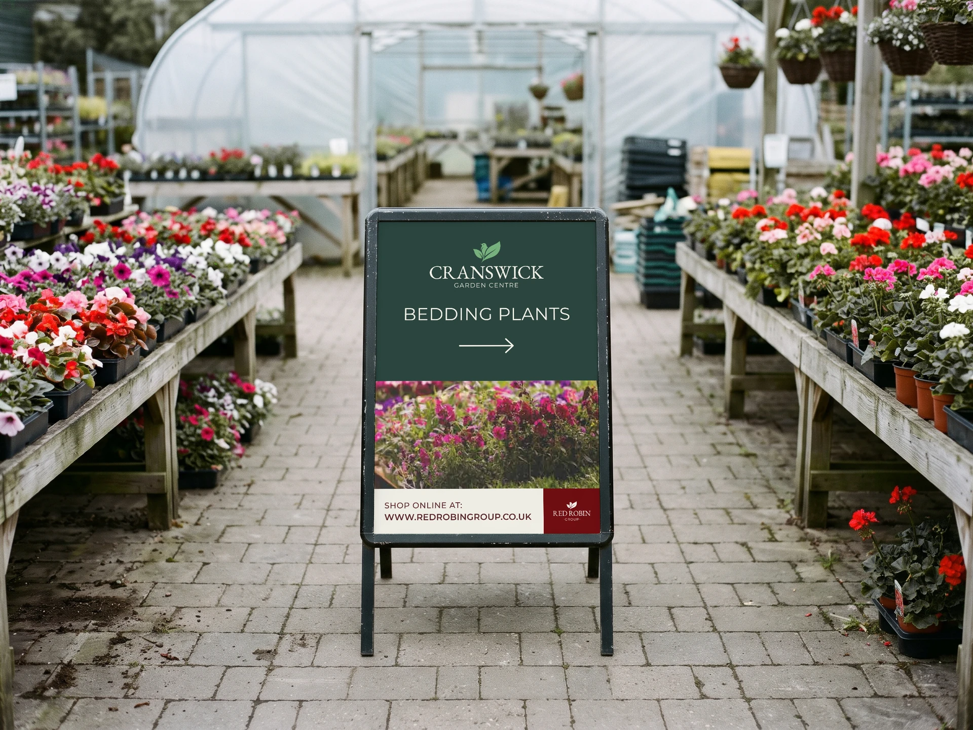
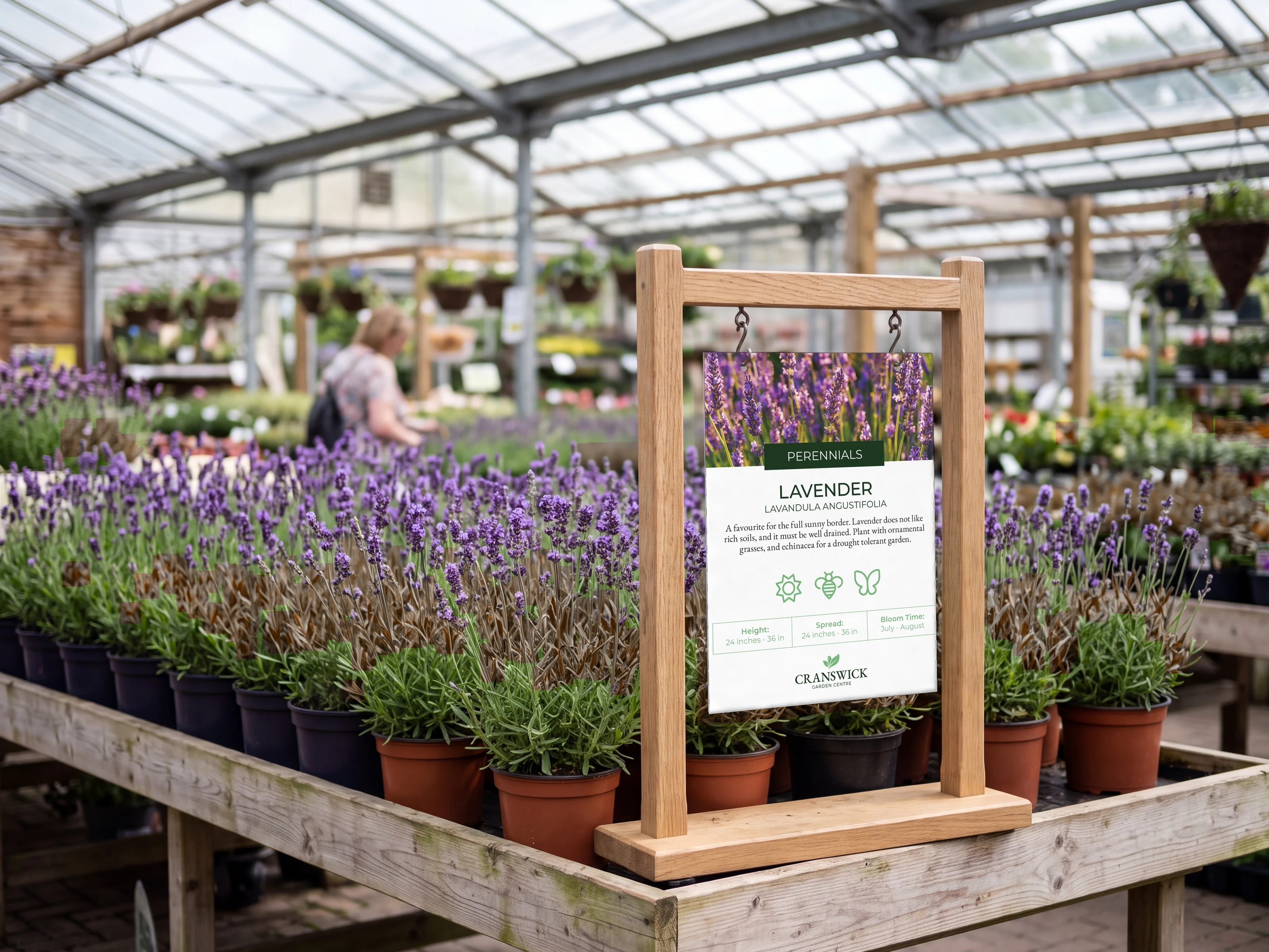
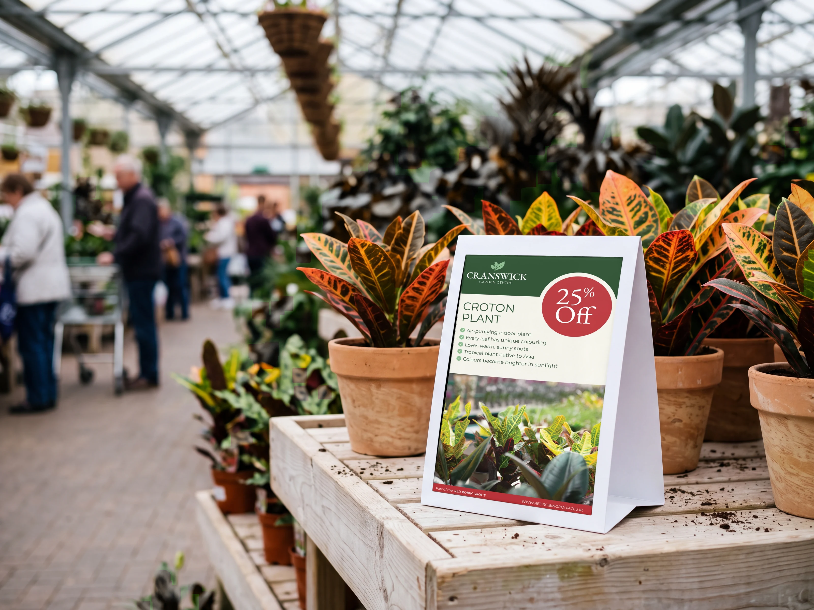
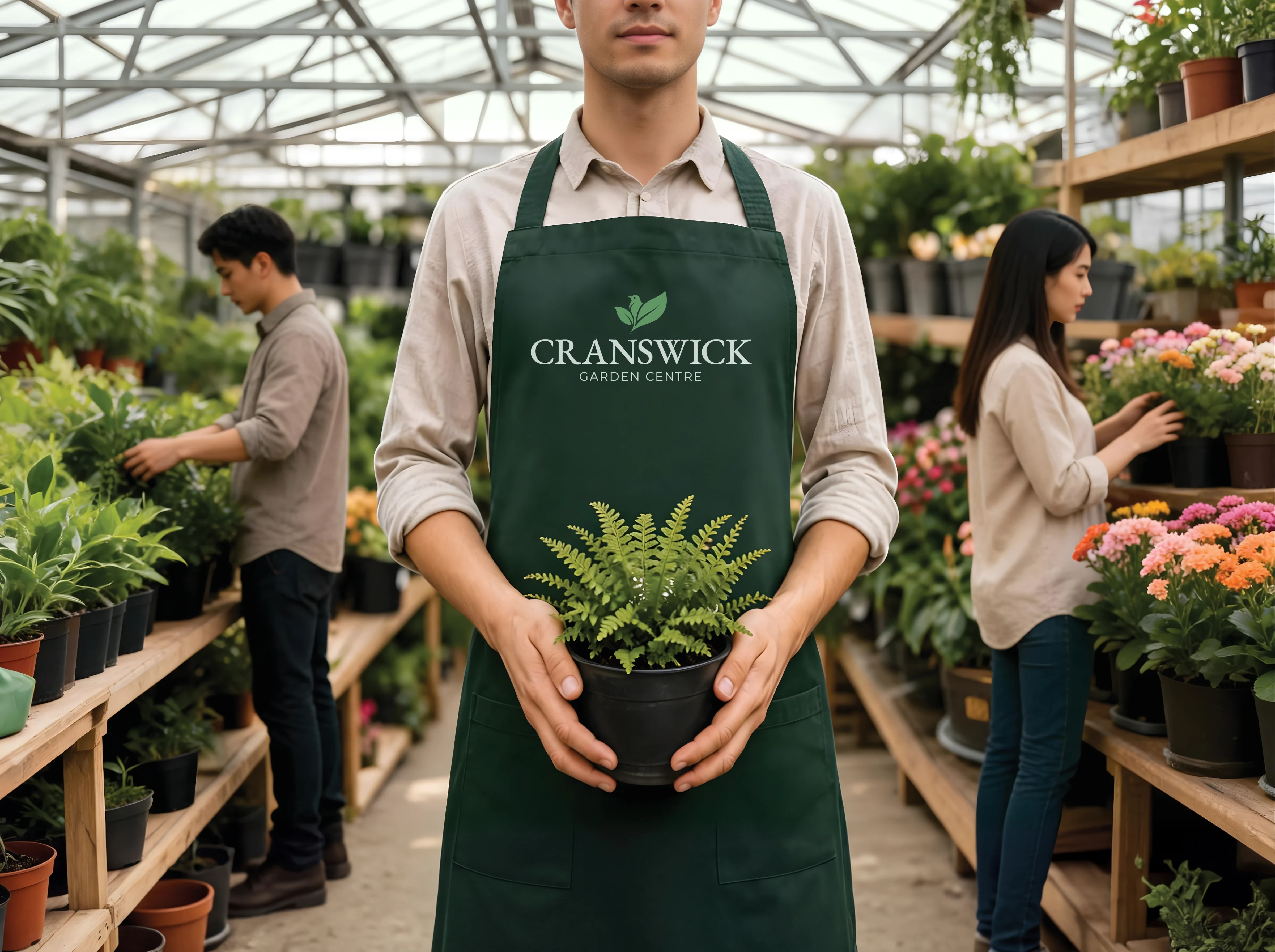
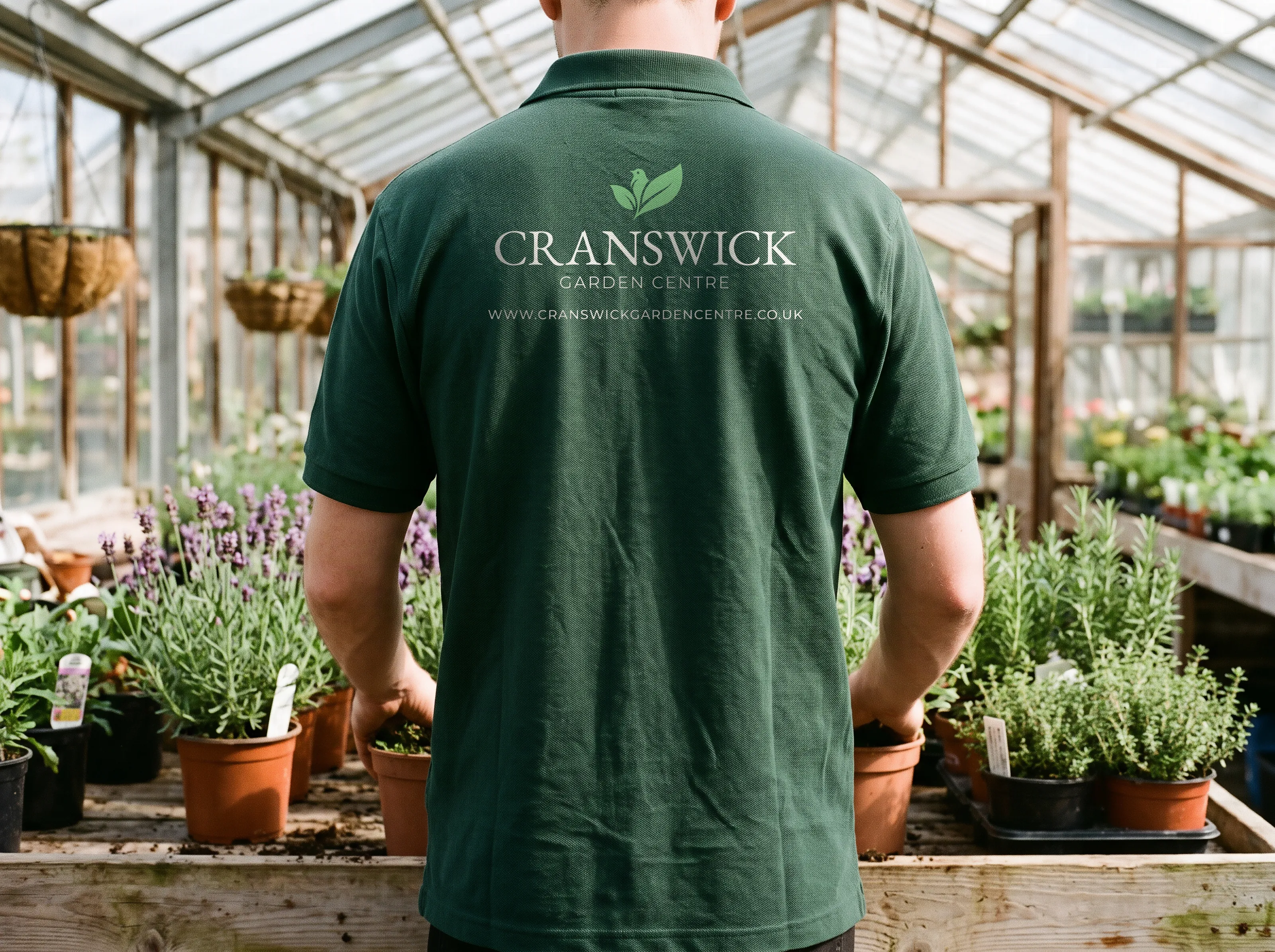
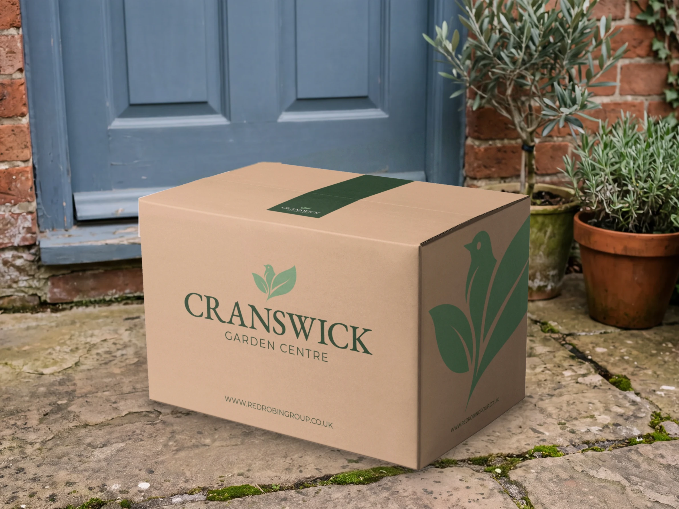
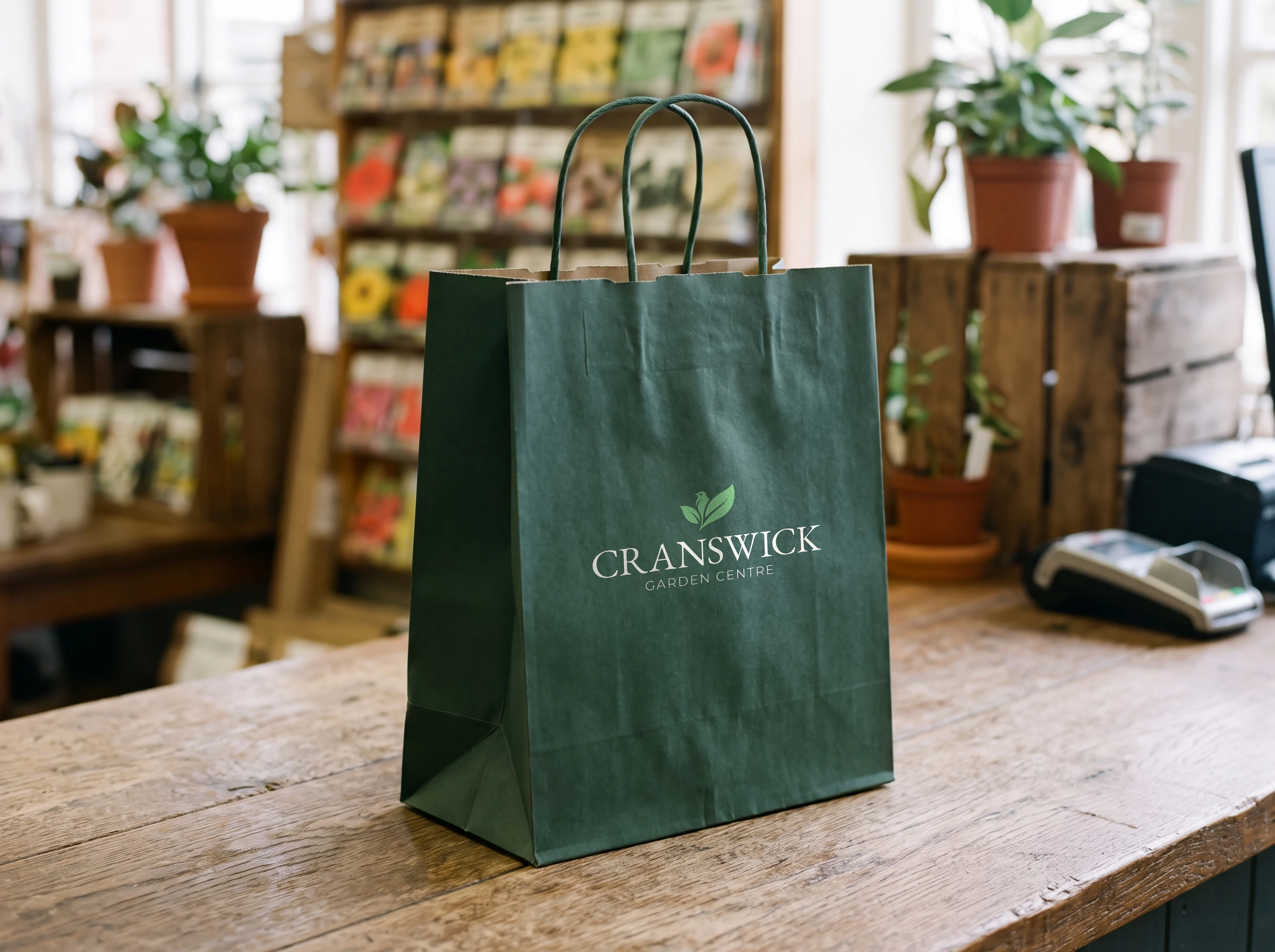
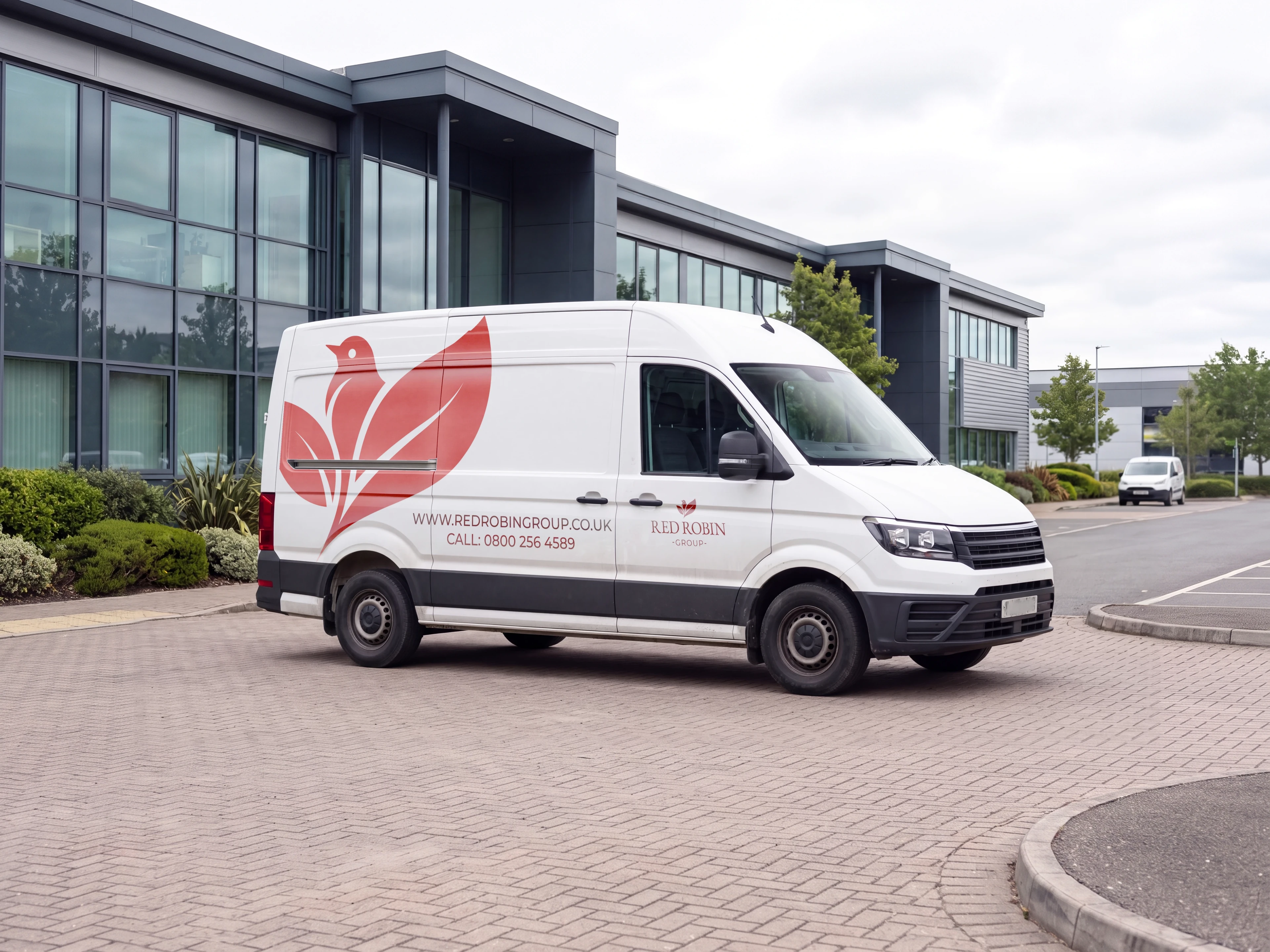
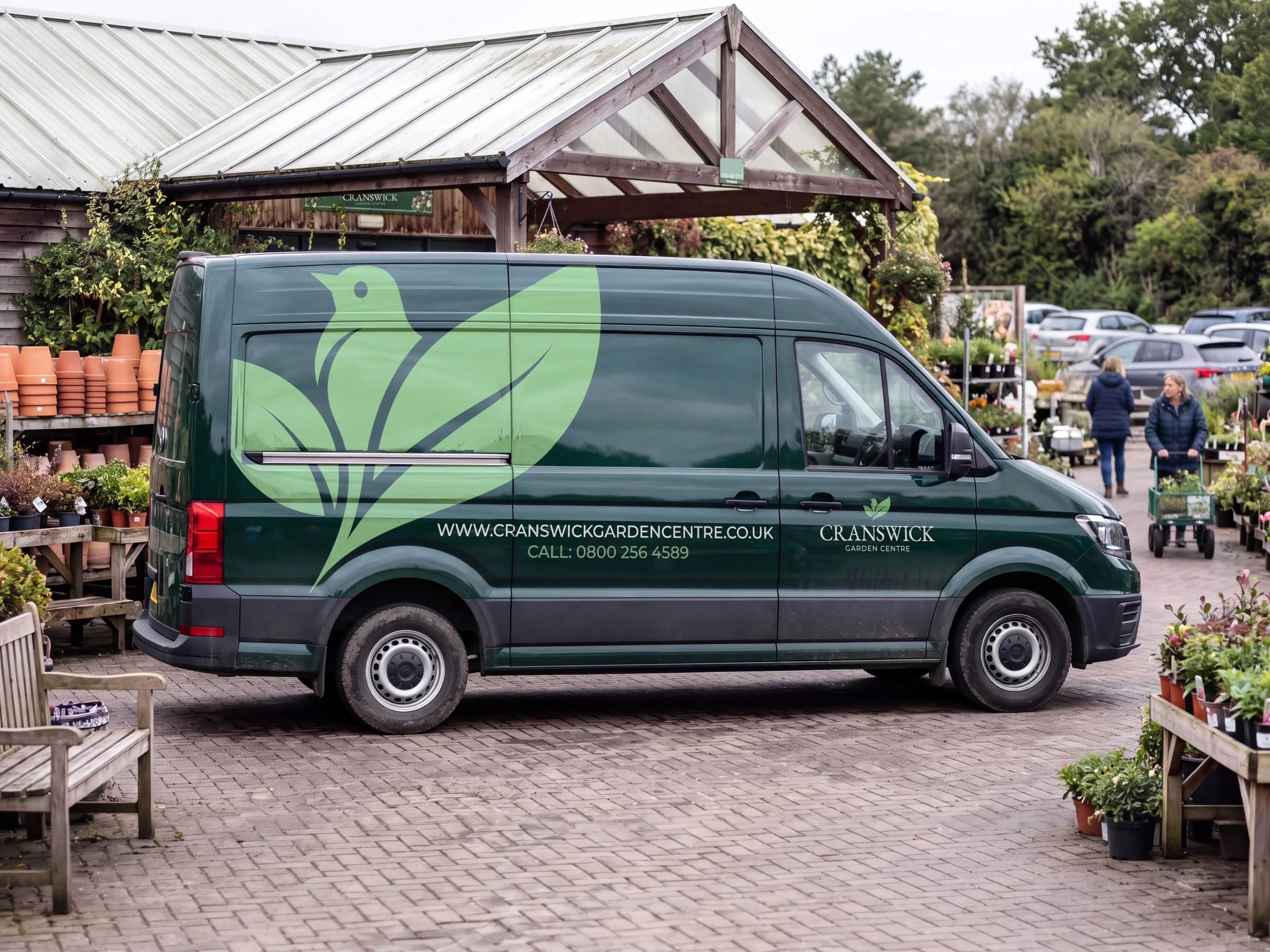
Two livery designs, a white group van with an overscale red robin and a deep green Cranswick van, alongside staff clothing, feather flags, A-boards, wayfinding, carrier bags and POS templates the team can produce in-house. All shown as design concepts.

Ecommerce, in development

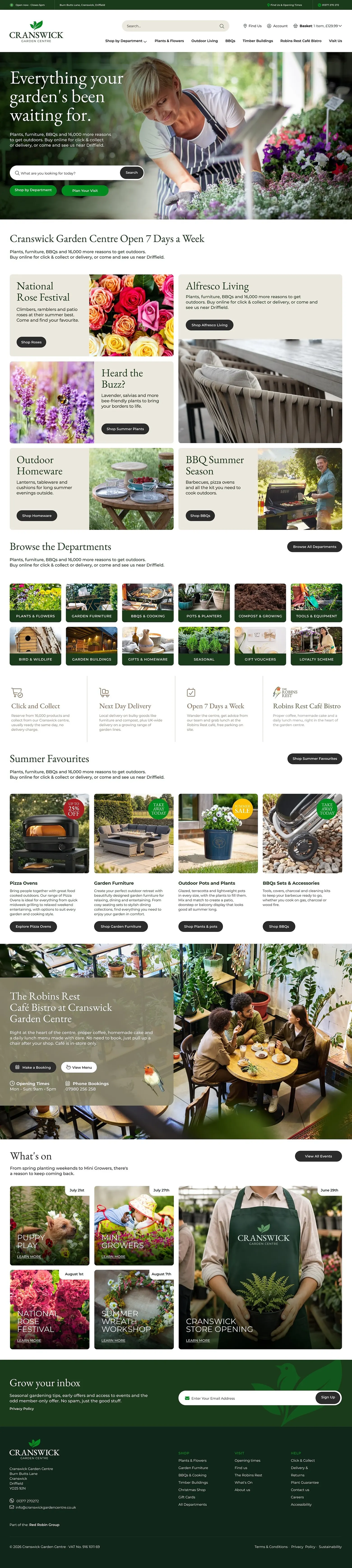
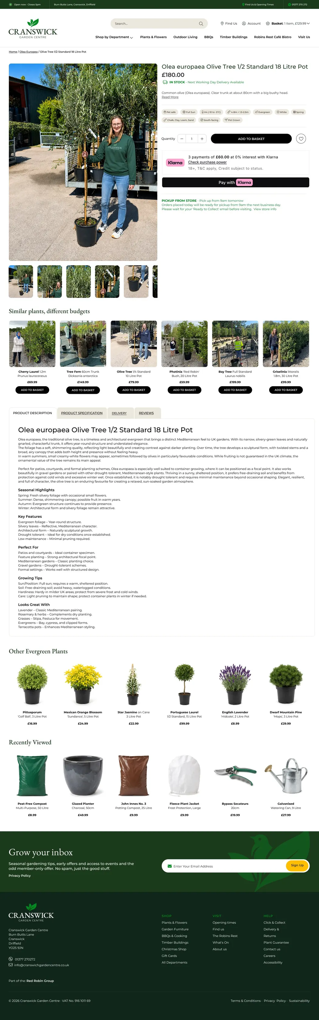
We designed the Cranswick ecommerce experience: a lifestyle-led homepage, twelve clear departments and detailed product pages with plant attributes, care advice and related ranges. The site is currently in development.

The result.

Ready to welcome the next centre,​ ​without asking it to change its name.

In short

Red Robin Garden Centre Group starts with one garden centre, Cranswick, near Driffield, and a plan to bring more established garden centres into the family over time. Each centre already has a name and regular customers, so a blanket rebrand would throw that goodwill away, while no parent brand at all would leave each centre working alone on signage, marketing and its website.

We set out the brand architecture: each centre keeps its own name and sits under the line Part of the Red Robin Group. After six initial identity directions, the mark developed from a pair of leaves into a robin settled among foliage. The shared palette has six colours: Robin Red and Burnt Red for the group, Evergreen and Moss Green for the centres, and two neutrals. EB Garamond carries headlines and signage, and Montserrat handles everything practical.

We showed the identity at work at Cranswick Garden Centre, its founding location, with two van livery designs, staff clothing, feather flags, A-boards, wayfinding, carrier bags and POS templates the team can produce in-house, all shown as design concepts. We also designed the Cranswick ecommerce website: a lifestyle-led homepage, twelve departments and detailed plant pages with attributes and care advice. The site is in development.

The result is a garden centre group brand that is ready to welcome the next centre without asking it to change its name.

+18%

More footfall at Cranswick after the rebrand

+30%

More repeat customers in the first year

+40%

More social followers in six months

Thinking about a similar project?

Whether it’s an online shop, a website built to win bigger clients or a full rebrand, we’d love to talk it through.

Book a discovery call

What can we help with?

A ballpark helps us suggest the right scope. No hard sell, promise.

When would you like to start?

We reply to every enquiry personally. The kettle’s on.

← BackChoose at least one to continue.Continue →

We’ll email you with times for your free discovery call.

  1. 1We read it properly. A designer, not a salesperson, looks at what you need.
  2. 2A free discovery call, about 20 minutes. Honest advice, whether or not we work together.
  3. 3A fixed quote and timeline in writing. The price we agree is the price you pay.
Sorry, that didn’t send. Please try again, or email info@mambo.agency.