The challenge.
Four expressions, one unmistakable signature.
MOVA is a premium restaurant brand with four expressions: Restaurant, Group, Events and Pavilion. Each needed to stand on its own, and all four needed to be unmistakably MOVA.
The design objective was one brand signature, refined enough for a premium dining room and flexible enough to carry a group, an events offer and a pavilion without losing recognition.
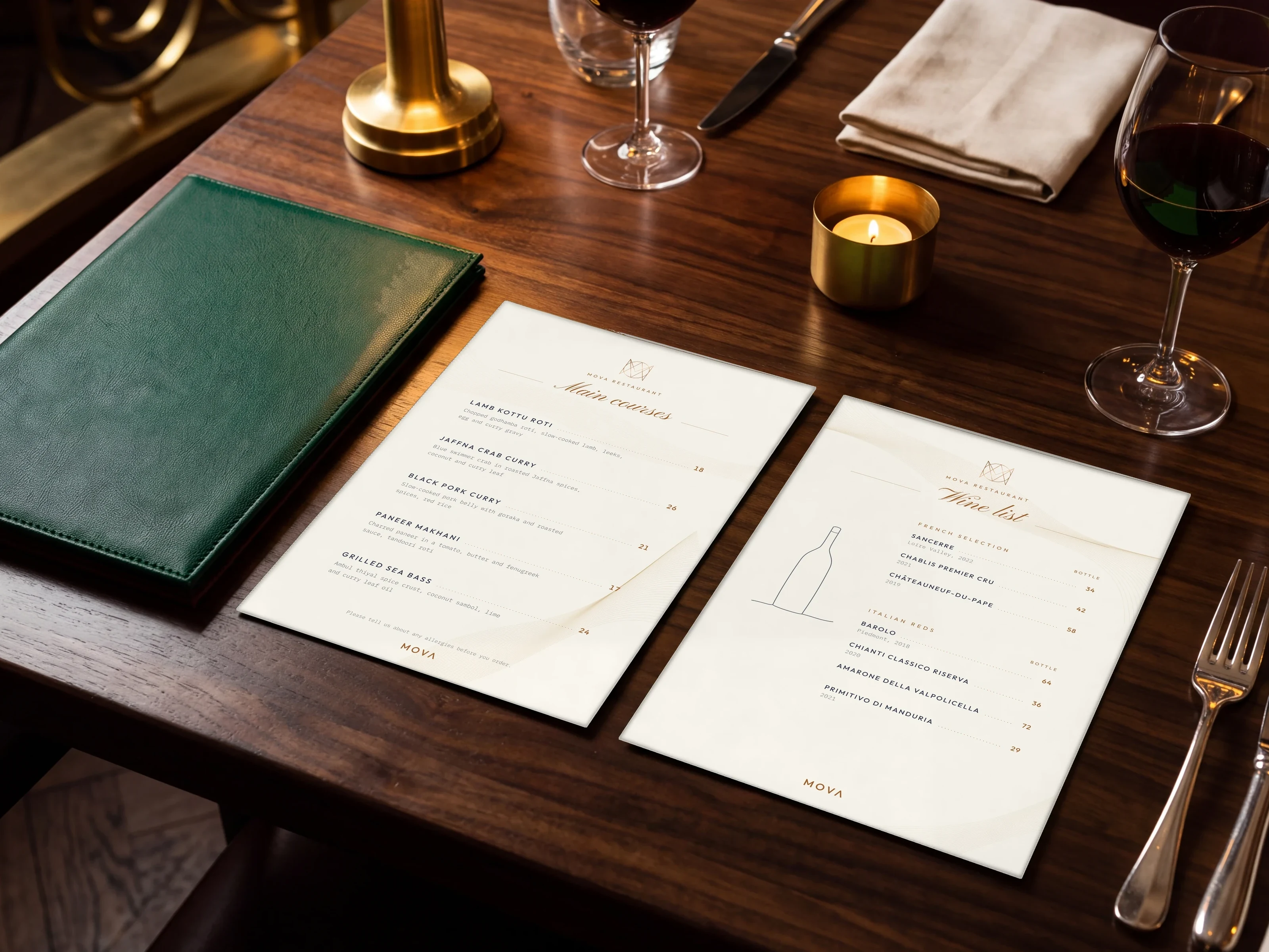
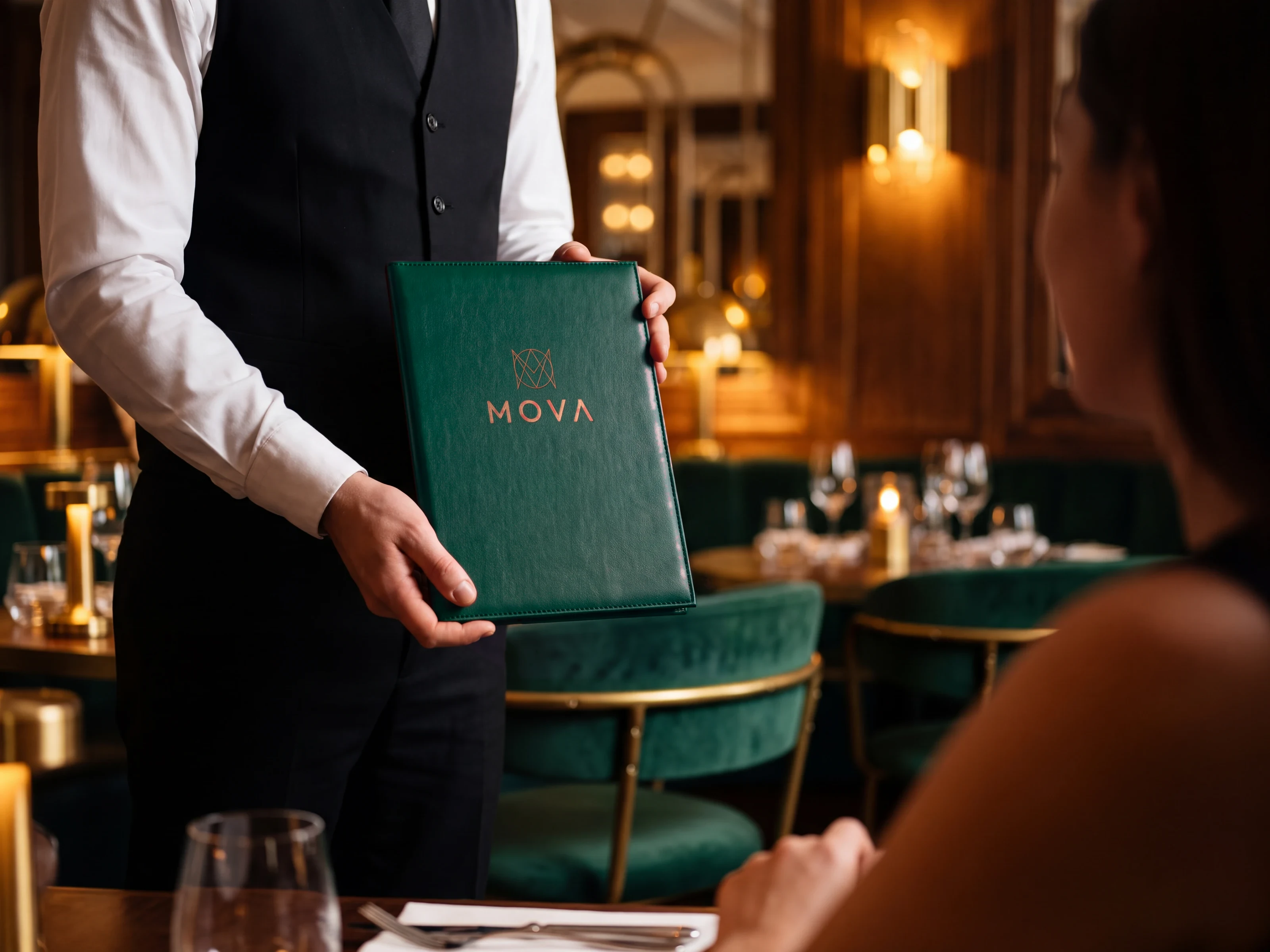
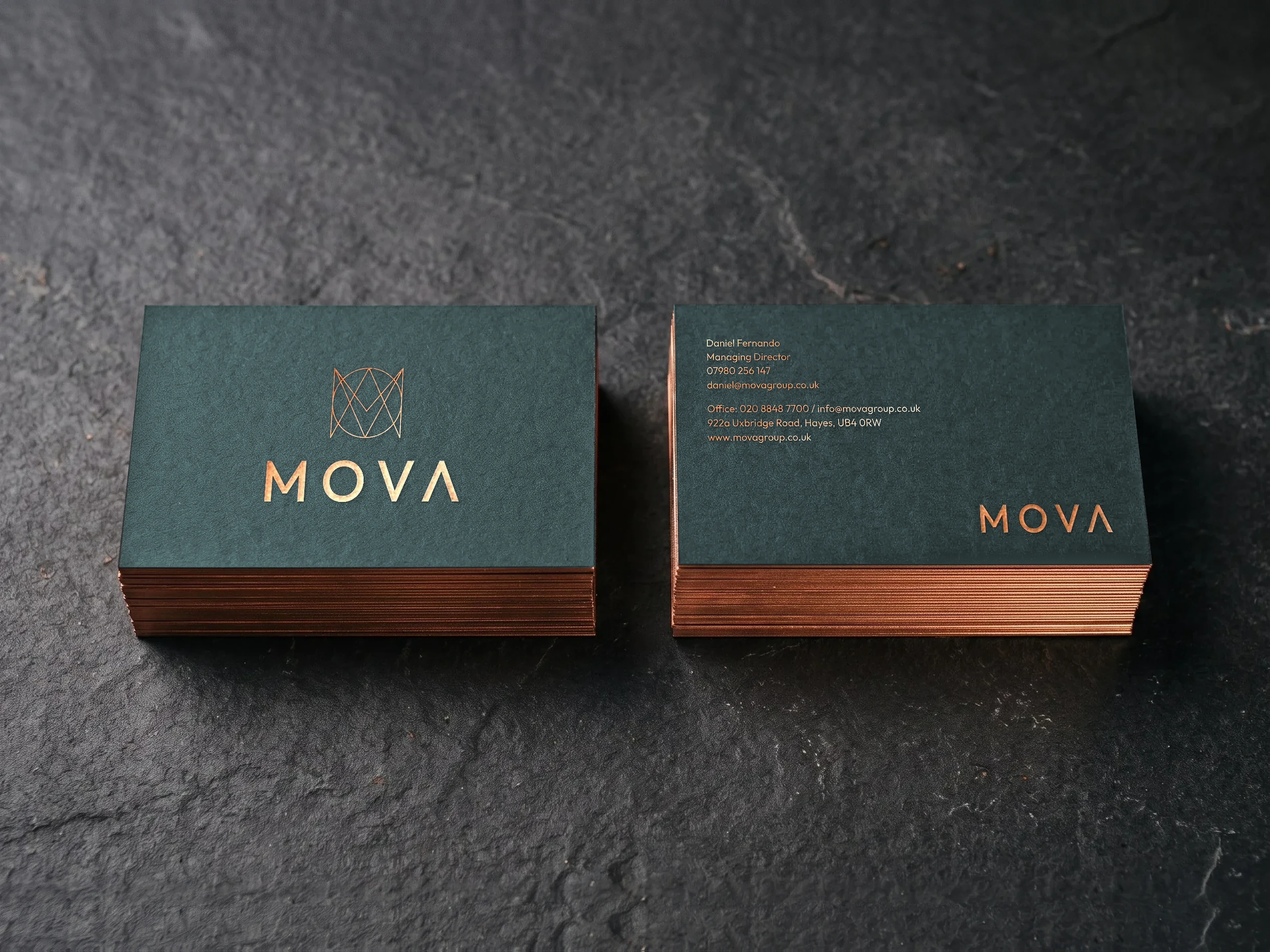
It also had to work at every scale, from a copper-foiled business card and a menu cover to a sign above the door and a pull-up banner.
Where they were
Four letterforms.
M, O, V and A explored as single-line drawings, each built inside the same square.
Where they wanted to be
One monogram.
The four letters overlap into one geometric mark, refined enough to stand on its own.