The challenge.
Many services, one identity and one message.
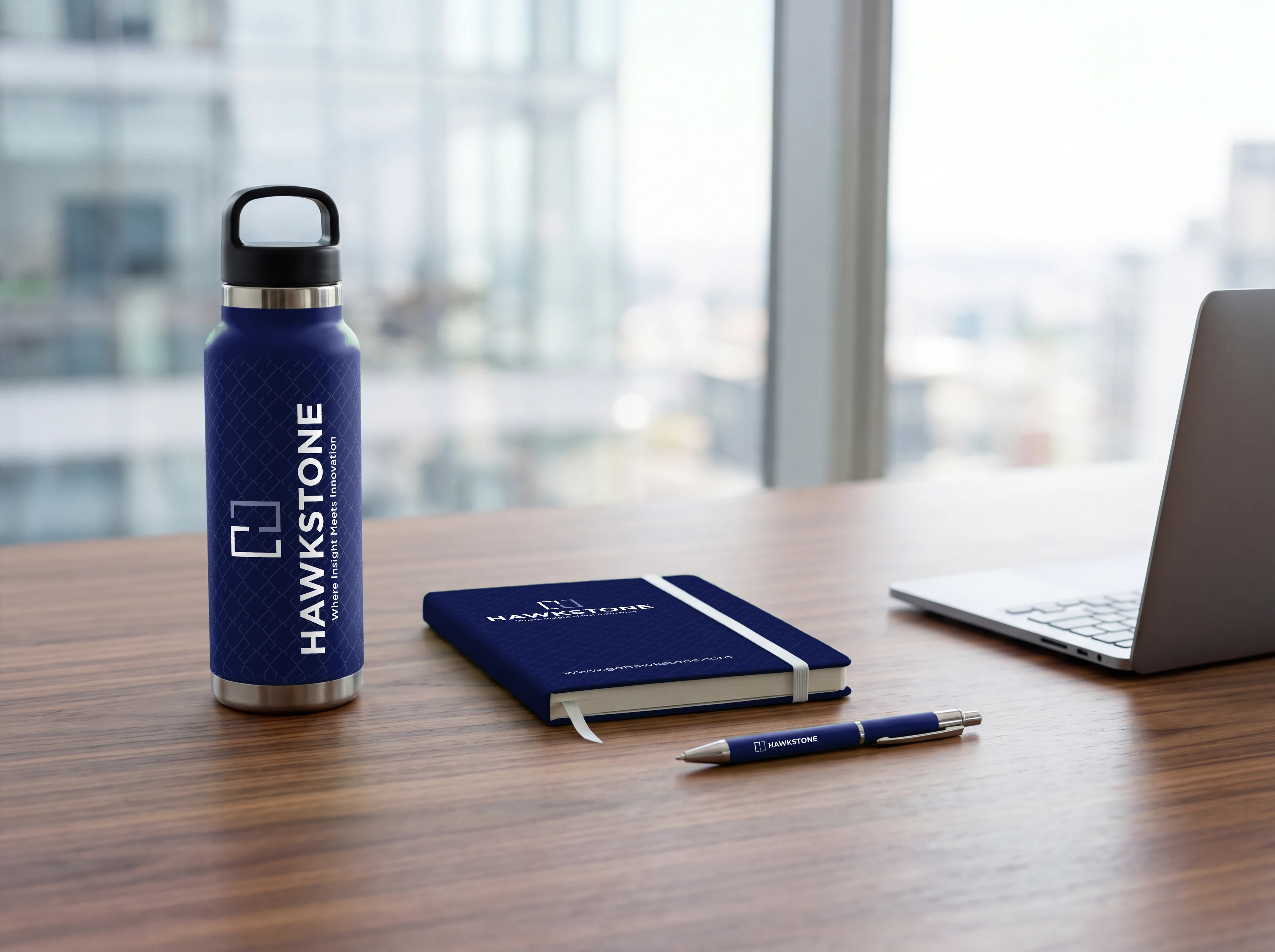
Hawkstone needed an identity that could carry a range of services under one recognisable brand. The goal was a mark that is distinctive, simple to recognise and consistent wherever it appears.
The brand also needed a single message. Separate straplines for each service risk confusing people, so we recommended one overarching line that represents the company as a whole.
The character had to be structured and assured, with adaptability built into the mark itself.
Where they were
Eight directions.
First ideas tested the name through grids, lines, circles, a tree and a bracketed H.
Where they wanted to be
One maze-inspired mark.
A geometric H drawn from two lines, with a confident wordmark and a single strapline.